CHANEL E-Commerse Redesign
Role: UI Designer
Duration: 4 Weeks
Description
Chanel is considered one of the power houses of the fashion industry. Since its founding in 1910 in Paris, Chanel has garnered a reputation for its unique fashion identity and continues to remain modern with its avant-garde artistic direction. The Chanel brand offers a wide range of accessories from hand bags to eyewear, fragrance, beauty, jewelry, and watch lines. It’s website, however, was not designed with the user experience in mind. The site is more focused on keeping to the overall aesthetic and their brand rather than the user finding what they’re looking for without hassle. For this challenge, my goal was to dig deeper into the reasons behind this, and identify and improve key areas in the customer journey.
Design Process & Deliverables
Research: User Tests, Competitive Analysis, Initial Research
Analysis: Card sorting, Site Map
Design: UI Design, Design Systems, UX Design
Finalization: User Testing, Iterations, High Fidelity Prototyping
Understanding Buying Personas
Chanel serves millions of users around the world - but these users can be segmented into 4 different personas based on their buying behavior or characteristics. Additionally, a consumer may sometimes fall into multiple categories. For example, a consumer may be an occasional splurger for one product, but a big spender for another. Individuals can also move across categories over time. For this project, I focused on the occasional splurger looking to purchase a handbag.
click the drop down arrows to see information and data
-
A consultant who selects clothing for editorials, print, television, music videos, and public appearances typically made by celebrities, models, and public figures. They’re familiar with the brands their clients favor and are typically looking to decide on items and purchase them quickly. This group is willing to experiment with new brands and products. They make up a significant amount of the market, sitting at about 20-25%.
-
A consumer who looks at displays in retail store windows without going inside the stores to make a purchase. Many of these consumers are younger and follow the brand and aspire to someday purchase its products.
-
Mostly characterized by the consideration phase, where they take ample time and effort to “be sure” about their decision before spending money on a huge luxury item. They represent about 15-20% of the market.
-
A person or organization that spends money freely or extravagantly. Money isn’t a problem to this persona. Doesn’t tend to do much research before making a purchase. They are habitual, frequent luxury shoppers and tend to have strong loyalty to multiple brands. These consumers sometimes view luxury products as more of a hobby and build collections based off of their purchases. They represent about 10-15% of the market.
Considerations
Discover
Am I going to like this product in real life?
In this phase, the occasional splurger usually sees the product on social media and is beginning to their research on the product.
Research
Does it have useful features that fit my needs?
The occasional shopper will now research the product to ensure that they are putting their money into something that can be as useful to them as it is appealing to them.
Consider
Have I explored every other option to make sure I’m making the right decision?
This is a significant investment for the occasional shopper, so they want to be sure they have considered all their options and alternatives before making a decision.
User Testing and Pain Points
I conducted 6 user tests on shoppers ranging from the ages of 32 - 40, which is the typical age range for the occasional splurger. I went into user testings wanting to see if the following objectives were easily achievable.
Can users easily find the handbag section?
Can users easily pick out a handbag that stands out to them?
Can users navigate between handbag types without any issues?
Were users able to make an informed purchase at the end of their shopping experience?
Below are my main takeaways.
Navigation
It is difficult to find the “handbag” section on the Chanel website. This could dissuade the user from finding the exact item they want and lead them to leaving the site.
Once finding the handbags, the page obligates users to scroll to the bottom of the page in order to discover the different types of bags. Users can’t easily jump and compare products, which leads to FOMO or frustration.
Product Listings
There is no option to filter the search.
There is no option to change the featured product.
Prices are not clearly visible.
Shopping
There is no “shopping bag” function for the handbags. This is an issue for someone who prefers to shop online.
There are no photos to show how the bag could be styled, which can make the user hesitant to purchase.
The How
How might we help the Occasional Splurger feel confident in their browsing process and buying decision?
Solution
The primary issues are navigation, layout, and the filter options of the site.
I can improve the customer experience and make a redesign that focuses on navigation and product browsing so that the users needs are fulfilled while keeping the overall aesthetic of the brand.
New Site Map
Sketches and Wireframes
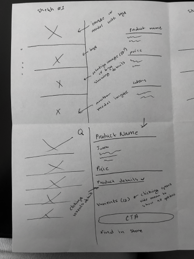
In the next step, I sketched out some potential changes keeping in mind one of the final steps in the process, which is viewing a product’s information.
Next, I created some potential wireframes of the product page that might support both the user and the business goals of the brand.

High-Fidelity Prototype - Homepage
In making the redesign, I decided not to change the colors of the site in order to remain on brand.
The homepage didn’t need any redesigning other than a new navigation menu at the top of the screen.

High-Fidelity Prototype - Landing Page
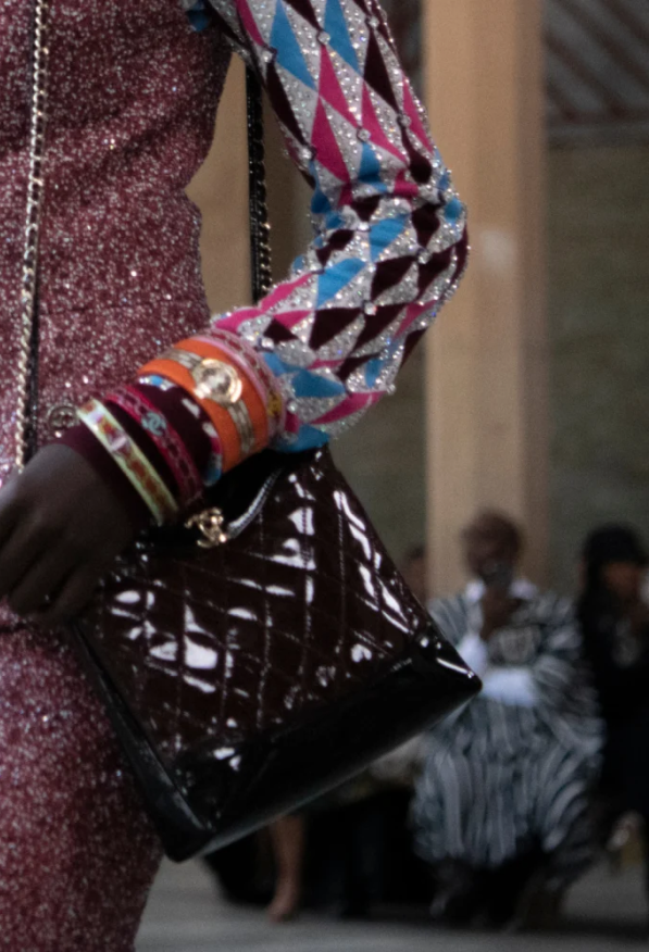
The previous landing page featured many videos and photos from the 2022/23 Métiers d’art show. The imagery continues and has the user scroll to the bottom of the page just to see the kind of bags the brand carries. Having to do all this scrolling can lead to users becoming frustrated and abandoning their search.
Here, users can get a glimpse
at the kind of bags offered.
The Popular Bags section features
products that have been the most
frequently purchased or favorited
on the site, giving users an idea of
what is currently in style.
The category section allows
users to shop based on the
style of bag users are
looking for.
High-Fidelity Prototype - Product Page
The previous product page featured three sections that give a design view of what to expect when getting a classic CHANEL handbag, but not much else to go on. Product page now features all current bags under Classic Handbags with brief
product descriptions and prices. There is also sort and filter options to arrange
listings from the users preference. Users can also favorite options to view later.
After selecting the bag, users receive a full
product description as well as a photo with
a model to show true sizing and styling.
Users can also add the product to a wishlist and see other suggestions, in order
to be sure of all options available.
High-Fidelity Prototype - Checkout
Previously, there was no checkout screen available for handbags.
Shopping bag features structured information about the product.
Options to pick up at a boutique or have product shipped (based on price).
Conclusion
Final Thoughts
The Chanel website could be made more engaging and efficient for users if aesthetics and experience met somewhere in the middle.
With the changes made to the site’s navigation, users would be better equipped to find the product or products they are looking for.
This means that the occasion splurger (our persona), will be able to easily find the perfect handbag they want without any regrets afterwards.
Going Forward
Listed below are things I would have liked to accomplish if I had more time on the project.
A function that compared Chanel products to other luxury brands
tablet layout.A function that allows users to get a 3D view of the product to thoroughly see details.
A built out customer service chat feature.


